Search Console’s New Look in 2025: More Than Just a Logo Change
Posted On: July 23, 2025
Reading Time: 4 min read
Share:


Keep Up with Marketing Trends
Get the weekly newsletter

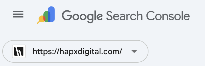
Google has subtly introduced a new logo for Google Search Console, signifying another phase in the company’s continuous visual update of its product lineup. The refreshed logo showcases a contemporary analytics-themed design featuring a magnifying glass, utilizing Google’s trademark color scheme of blue, green, yellow, and red.
What’s Changed?
The new icon swaps out the old toolbox design for a sleek magnifying glass and bar chart combination, symbolizing:
- Search and discovery
- Insights and performance monitoring
- Google’s broader shift toward clean, colorful, data-forward design
As part of its methodical effort to update its visual identity, Google has updated its logo. For the first time in ten years, Google recently changed its primary “G” icon .It aligns with Google’s recent branding updates across its ecosystem, offering consistency and a more modern feel — especially as AI and data visualization play bigger roles in how we optimize and report.
“Of course a bar chart had to be included,” said Google Search Central on X, confirming the change with a playful nod
A Brief History of Google Search Console
Google Search Console wasn’t always known by that name. When it first launched in 2006 as Google Webmaster Tools, it was a tool for developers and site owners to track indexing and search performance.
Google changed the tool’s name to Google Search Console in 2015 to better represent its wider user base, which now includes marketers, business owners, SEO specialists, and webmasters.
Since then, the platform has undergone a number of usability enhancements, feature rollouts, and interface upgrades, changing from a diagnostic tool to a crucial component of any serious SEO strategy. The new logo represents just the latest milestone in that ongoing transformation.
Design Consistency Across Google Tools
Google’s Material Design philosophy, a cohesive design system that prioritizes responsiveness, visual hierarchy, and clarity, is in line with the updated logo. Google Analytics, Google Ads, and Google Business Profile have all seen similar branding updates, indicating a broader initiative to update the user experience across all platforms.
For professionals who use several Google products on a daily basis, this consistency provides a more seamless experience. Additionally, it strengthens familiarity and trust, two important elements in tool adoption and sustained use.
Why SEOs Should Care
The update, although solely visual, highlights Google’s ongoing commitment to Search Console as an essential resource for webmasters, SEOs, and content creators. It also serves as a reminder to:
- Maintain your Search Console account’s activity and integration.
- Consistently check for indexing problems, declines in performance, or improvements in structured data.
- Remain vigilant for upcoming changes in user experience and functionality.
Mobile-Friendly & UX-Focused Design Evolution
Additionally, Google’s emphasis on mobile-first design is in line with the recently updated logo. Scalable and responsive visual elements are becoming more and more crucial as more SEO experts and business owners utilize tools on mobile devices.
Whether viewed through a mobile browser or a desktop dashboard, this updated appearance guarantees that the Search Console icon will always look neat and professional. It’s a minor but important nod to accessibility and usability in the multi-device world of today.
The Bigger Picture: Evolution, Not Just Aesthetics
This visual update implies that Google still views Search Console as a crucial webmaster touchpoint. Tools like Search Console are even more useful for preserving and enhancing website visibility as search algorithms get more complex and user experience considerations take center stage in rankings.
This update’s timing also aligns with current debates regarding AI’s effects on search, demonstrating the continued applicability of conventional SEO techniques and tools in the changing digital environment. Google is probably preparing users for feature upgrades that complement its forward-looking search priorities by modernizing its branding and interface.
Looking Forward
For SEO professionals, this logo update serves as a gentle reminder to stay engaged with Search Console’s evolving features and capabilities. While the visual change is subtle, it represents Google’s ongoing commitment to providing webmasters with the tools they need to succeed in organic search.
Keep an eye on your Search Console dashboard – who knows what new features might accompany this fresh visual identity in the coming months.